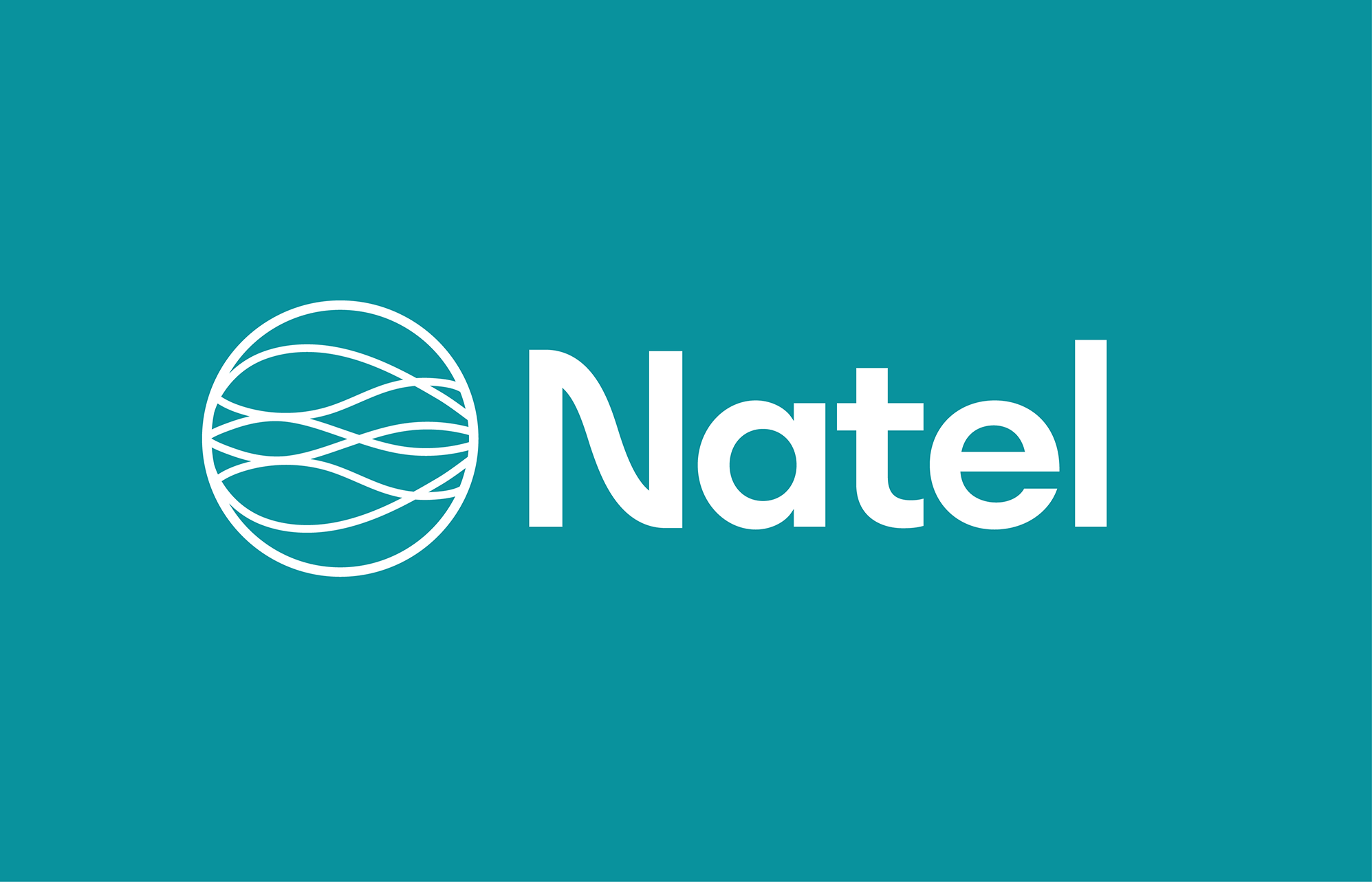
Natel Energy Branding
Branding / Logo Design
Spring 2024
MT ︎︎︎ Studio


Natel is is a high-performance, FishSafe™ hydropower engineering company based in Alameda, CA. Along with the MacFadden and Thorpe team, I worked to move the brand language towards one based in organic curves. This connects to multiple aspects of Natel from the shape of their turbines to the fish and river ecosystems they work to protect.
According to MT, “ This is paired with a wordmark where the “N” tapers in a wave-like curve. Retaining their signature color Nateal, akin to John Deere’s green or Caterpillar’s yellow, we expanded their palette and modernized their typography.”
I (specifically) created the symbol for the logo, worked to expand Natel’s color palette, created graphic language elements taken from the new logo, and explored typography. I then worked to apply this new system to a variety of assets across platforms.
Art direction: Brett MacFadden and Scott Thorpe
Typefaces used: Euclid Circular A
